HTML form inputs have always been notoriously difficult to style with CSS, but there are several little-used selectors that give us significant power to style inputs and surrounding elements. Some of these are relatively new, while others have been available for quite some time.
:placeholder-shown
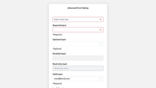
Link to this sectionThe first selector is relatively new and doesn’t have complete browser support yet. However, this seems like something that could easily work as a progressive enhancement. The selector allows us to detect whether a placeholder is currently visible to the user. This could come in handy if we want to dynamically hide and show the input’s associated label.
Here I am hiding the label until the user types in the input, thus hiding the placeholder. I use a nice transition effect to display the label. Note that for this to work, the label must come AFTER the input.
<div class="form-group">
  <input type="text" id="dynamic-label-input" placeholder="Enter some text">
  <label for="dynamic-label-input">Enter some text</label>
</div>
.form-group {
position: relative;
padding-top: 1.5rem;
}
label {
position: absolute;
top: 0;
opacity: 1;
transform: translateY(0);
transition: all 0.2s ease-out;
}
input:placeholder-shown + label {
opacity: 0;
transform: translateY(1rem);
}:required
Link to this sectionUse this selector to indicate that an input has the required attribute. Here I am using an empty .help-text span and placing some content dynamically using the ::before pseudo-element. Realistically, this would be done with JavaScript, but I am including here to demonstrate a pure CSS approach.
<label for="required-input">Required input</label>
<input type="text" id="required-input" required>
<span class="help-text"></span>
input:required + .help-text::before {
content: '*Required';
}:optional
Link to this sectionThis selector does the opposite of :required. I am again using an empty .help-text span to display some optional text if the required attribute is NOT present.
input:optional + .help-text::before {
  content: '*Optional';
}
:disabled
Link to this sectionThis one should be familiar to most of you, but still important to remember. It’s pretty essential to display whether or not an input is disabled to a user.
&:disabled {
  border-color: var(--gray-lighter);
  background-color: var(--gray-lightest);
  color: var(--gray-light);
}
:read-only
Link to this sectionAn input with the readonly attribute should convey a slightly different meaning than a disabled input. Thankfully we have this selector to help with that.
<input type="text" value="Read-only value" readonly>input:read-only {
border-color: var(--gray-lighter);
color: var(--gray);
cursor: not-allowed;
}:valid
Link to this sectionWhile much form validation will happen with JavaScript, we are able to take advantage of HTML form validation and style inputs accordingly. This selector gives us the chance to style any input which is currently passing the native browser validation rules.
Here I am encoding an svg to display a checkbox in the input using the background-image property.
input:valid {
  border-color: var(--color-primary);
  background-image: url("data:image/svg+xml,...");
}
:invalid
Link to this sectionThis selector checks if an input is currently NOT passing the native browser validation rules (for example, if an email input does not contain a real email).
Again, I am encoding an svg to display an ‘x’ in the input.
input:invalid {
  border-color: var(--color-error);
  background-image: url("data:image/svg+xml,...");
}
I can also customize some validation messages for each input type using the .help-text span and the ::before pseudo-element.
<label for="invalid-email">Invalid input</label>
<input type="email" id="invalid-email" value="notanemail">
<span class="help-text"></span>
input[type='email']:invalid + .help-text::before {
content: 'You must enter a valid email.'
}:in-range/:out-of-range
Link to this sectionThese selectors detect whether the value of a number input is within the min/max values specified or not.
<label for="out-of-range-input">Out-of-range input</label>
<input
  type="number"
  id="out-of-range-input"
  min="1"
  max="10"
  value="12"
>
<span class="help-text">(value must be between 1 and 10)</span>
input:out-of-range + .help-text::before {
content: 'Out of range';
}:checked
Link to this sectionMost of you will be familiar with this selector. It gives us the ability to apply custom styles to checkboxes and radio buttons when checked. My technique for styling checkboxes involves creating a wrapper element and placing the label after the input.
I visually hide the input so that it disappears from view but is still clickable. Then I style label::before to look like the checkbox input and label::after to look like a checkmark. I use the :checked selector to style these two pseudo-elements appropriately:
<div class="checkbox">
  <input type="checkbox"/>
  <label>Option</label>
</div>
&:checked + label::before {
background-color: var(--color-primary);
}
&:checked + label::after {
display: block;
position: absolute;
top: 0.2rem;
left: 0.375rem;
width: 0.25rem;
height: 0.5rem;
border: solid white;
border-width: 0 2px 2px 0;
transform: rotate(45deg);
content: '';
}Getting a Head Start with the HiQ Framework
Link to this sectionMy new CSS framework HiQ provides some useful base styling for HTML form inputs, including checkboxes, radio buttons, and disabled inputs.
HiQ is lightweight and is built with CSS variables that can be changed dynamically, especially useful for theme switching.